

Data Insights for the UK’s largest exam board, empowering educators with user-friendly data-based insights
Experience definition and design for an exam analytics site designed for secondary school teachers in the UK providing both summative and formative results analysis showing both attainment and progress and helping teachers understand strengths and weakness among their students and understand the progress of students with different socio-economic and cultural backgrounds. We designed next phase AI-powered insights to call out key points within the data based on insights from teachers integrating AI directly into the experience. This is AQA’s main point of interaction with their large client-base of educators and education leaders.
AQA, the UK’s largest exam board and Avanade’s largest global customer, needed to replace their ageing results-analysis tool ERA (Enhanced Results Analysis) with something that could deliver far richer insight to schools while surviving the single biggest traffic spike in UK education: up to 10,000 concurrent users in the narrow window when GCSE and A-level results are released. We ran a phased discovery, design and build programme across three stages, culminating in a first live release that’s already handled peaks of 10,000+ concurrent users and performed faultlessly on its first real test on a GCSE results day.
ERA was AQA’s critical, and largely only, point of contact with schools and teachers, but it was showing its age. Duplicate report requests routinely caused delays of days just to generate a single report. Poor usability meant schools were exporting data into Excel or paying for third-party tools instead of using what AQA provided. As schools converted into academies, and academies grouped into Multi-Academy Trusts (MATs), ERA had no cross-centre/school view at all - trusts had no way to compare performance across their own schools without manually pulling and analysing the data themselves. Some schools had gone as far as employing their own data analysts just to deal with this complexity.
Underneath it all, ERA ran on a dated, expensive, non-scalable stack with no geo-redundancy, and had real performance issues at launch. It didn’t support modular qualifications, where components don’t need to be taken in a fixed order, and it had no way to analyse formative or mock exam data, which is exactly what schools need to understand how students will actually perform when the real exam lands.
This mattered because AQA needed to leapfrog competitor exam boards on insight quality for the 2025 results series, while the platform had to withstand a huge concurrent-user spike in a brutally narrow window, the application is genuinely only heavily used a couple of days a year, by millions of people, all at once. As AQA’s core service and main touchpoint with schools, a weak platform risked schools drifting to third-party analytics tools or to rival exam boards, many of whom were starting to modernise their own offering, which would in turn undermine AQA’s paid practice-exam revenue.
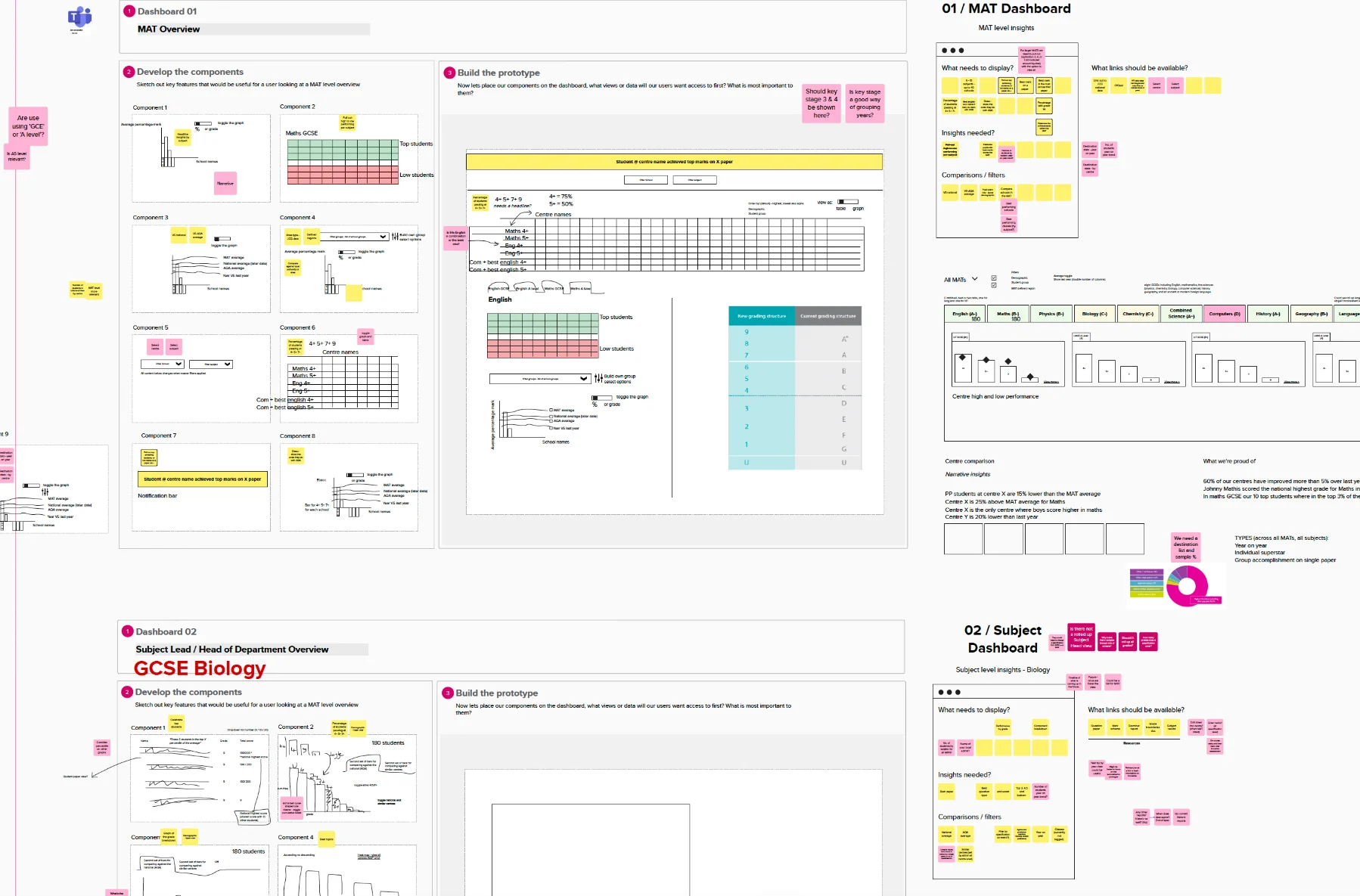
As Experience Design Lead, I was responsible for turning AQA’s vision into a validated, user-tested design across discovery, design and build:
- Set the vision - what the journey should look like for educators, and what was fundamentally needs to change from the existing model
- Co-created the clickable wireframe prototype with the UX designer, built with a realistic depth of data and graphs, an area I have strong prior experience in, having designed many complex dashboards and data visualisations before. Having previously been a teacher myself made this a genuine passion project; I could empathise directly with the users because I used to be one
- Defined AQA’s persona set, consolidating a previously fragmented mix of AQA- and agency-created personas, and established five experience principles: performant and reliable, easy to use, insights not data, role and personally relevant, and supported - that anchored every design decision
- Drove the core architectural decision: replacing ERA’s flat search-and-query model with a contextual, hierarchical interaction model that carried context from MAT or school, down through subject and component, to individual questions and students, and built comparison directly into the graphs rather than treating results and comparison as separate views
- Ran the collaborative review cadence - a weekly design council with AQA SMEs and stakeholders reviewing wireframes, research and workshop output across the full 8-to-12 month span
- Key to defining and selling the commercial and delivery approach, deliberately starting with a small, low-cost discovery phase to build AQA’s confidence before they committed to the full programme
Discover
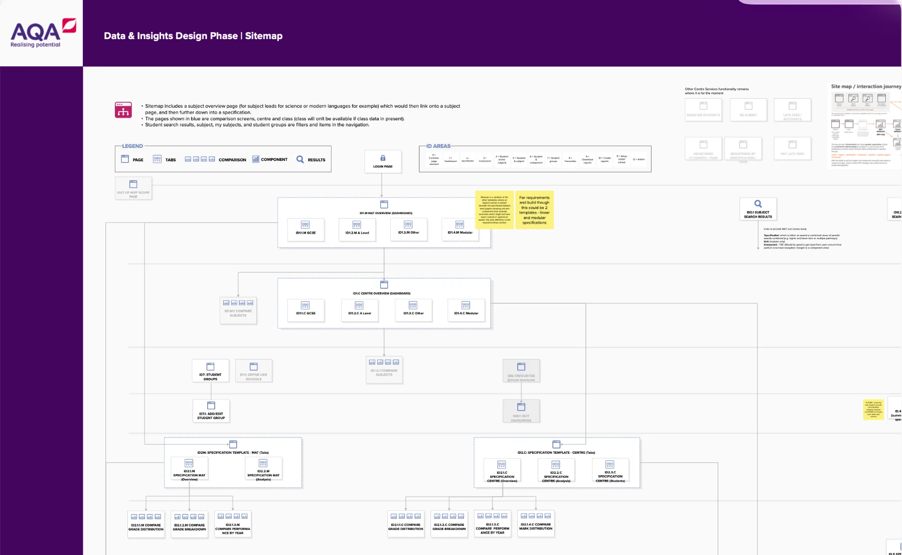
We built on an earlier full-day workshop with AQA’s business and technology leaders, education SMEs, and relationship managers - the people who act as the voice of schools within AQA. I facilitated workshops to define AQA’s vision, goals and roadmap, distilling everything into three programme goals: customer centricity, a competitor-surpassing insight service, and interactive dashboards for MATs and teachers. We built a first-draft prototype and ran a round of user testing to validate the direction, findings that directly strengthened AQA’s internal business case for the wider programme and helped them secure further budget.
Design
In the 10-week design phase, we aligned business requirements, completed a high-level technical design, and built a validated, build-ready backlog. Between each phase, we solutioned, priced and sold the next stage — I was key to every part of that commercial process being a design-led engagement.
This is where we rebuilt the interaction model around context, replacing constant back-and-forth navigation with one where results, grade analysis and student performance stay linked as users drill down. It was a major change for AQA, and it took real evidence from testing, plus strong feedback from teachers, heads of schools and MAT leaders, to get AQA to fully trust it.
We produced low-fidelity wireframes and an interactive prototype, refined across further rounds of testing, validating which chart types were genuinely clearest for reading performance data, and working through technical feasibility for how that data visualisation would actually be built. We also delivered high-fidelity visual designs and an atomic, WCAG AA-accessible design system, the first application built to AQA’s new brand guidelines, which meant working closely with AQA’s brand team on this signature early use of their new brand.
Build
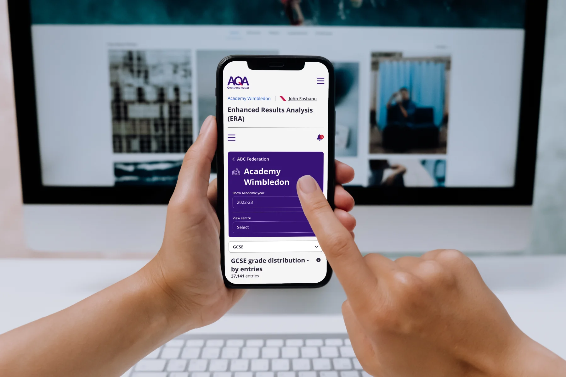
The 12+ month delivery phase began with 8–10 more weeks of design, then moved into build and test, continued design support, another round of user testing, and through to go-live. We shipped a platform handling 10,000+ concurrent user peaks on results day. Features shipped were directly validated in testing, accessibility-tuned designs, comparison overlays across factors like gender and student groups, and third-party demographic data brought in so schools could benchmark against similar cohorts. In total, we ran around 35 user tests across the programme, with weekly SME reviews feeding in further feedback gathered directly from schools.
The platform went live and performed brilliantly on the biggest results release day of the year, with AQA promoting it heavily and working closely with schools around the launch to promote and train. That strengthens AQA’s competitive position as the UK’s largest exam board, increasing the likelihood that schools stay with or swap to AQA, and adds credibility for the paid-exam market - private schools, secondary colleges, and a potential paid practice-exam service planned to be built on top of this platform.
Organisationally, it replaced a disjointed tool with no cross-school visibility with the first true multi-academy trust and cross-school view, laying the groundwork to unify summative and, eventually, formative assessment data in one platform. The roadmap we designed with AQA points toward the platform being used year-round, not just on results day, tracking how students are growing rather than just where they achieved at the end. It reduces schools’ dependence on paid third-party analytics and manual Excel exports by putting sophisticated analysis directly in teachers’ hands, and it sets up patterns to support future AI-driven suggestions, surfacing personalised pathways for the large middle group of students who typically get the least individual attention, showing each of them exactly where they’re strong and where they need practice.
From a UX perspective, the new contextual, hierarchical interaction model was strongly appreciated across nearly 35 in-person testing sessions spanning MAT leaders to classroom teachers, and the platform is fully accessible by design. It handled the results-day peak without issue. A few of the things teachers said in testing:
“This will save me so much work. Thank you very much.”
“The system is much quicker and more user-friendly. It looks powerful. I really like how this looks.”
“We have to analyse based on lots of different factors for our subject, and it usually takes me hours. I can see that this is going to speed up the process.”
“I love the colour coding and the ability to drill down on so many variables. This is really going to help me pinpoint areas for improvement.”
“This is stunning upgrade from AQA, in a collaborative effort with curriculum leaders. We as practitioners now have access to exam level analysis tools that can make a real difference to students. It will enable us to adapt curriculum sequencing and predict/fix knowledge gaps so students can attain higher.”
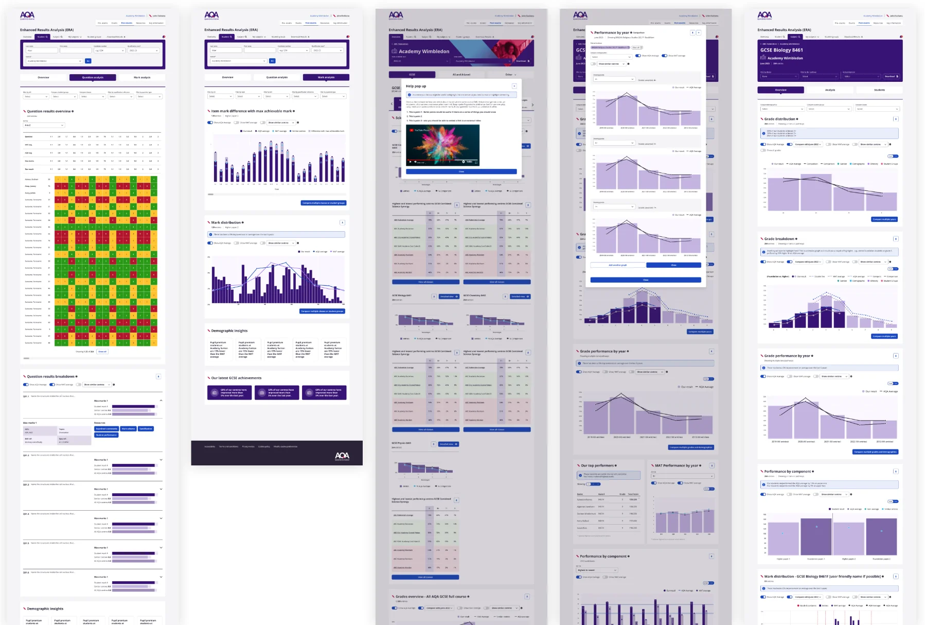
The biggest lesson from this project was that fixing the information architecture mattered more than adding features. AQA’s old tool wasn’t short on data, it was short on a model for navigating it, and rebuilding around a single, context-carrying hierarchy, from MAT overview down to individual student, did more for usability than any amount of new functionality could have. Getting there took real discipline: designing and validating the new interaction model and grounding every decision in over 30 in-person tests with the actual range of users, from MAT executives to classroom teachers, rather than assumptions and validating with our design council of SMEs, relationship managers, and technologists.
It also showed the value of a phased commercial approach on a high-stakes, high-scale engagement, starting small with an 8-week discovery, let AQA build confidence in both the concept and in Avanade’s ability to deliver, before committing to a build that had to survive 10,000 concurrent users on the most unforgiving day of the school calendar. Running an agile, workshop-based review cadence with AQA’s own stakeholders, rather than leaning on formal reports, kept a naturally risk-averse client engaged throughout, and showed the value of working as a genuine partner, designing almost in front of the customer, with the customer, alongside their subject matter experts, as one of their team.
Having once been a teacher myself, this was a real passion project, and I’m genuinely grateful to have played such a significant role in what’s one of my proudest professional moments.